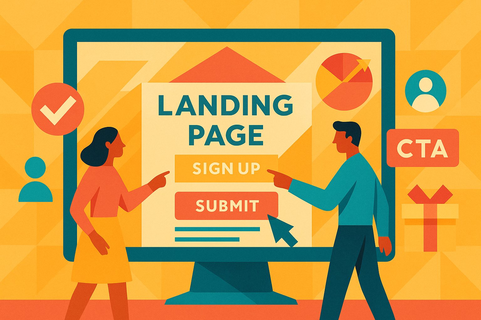
Setting the Stage with Irresistible Hero Sections
Imagine landing on a page that feels like it was made just for you—a vibrant visual greets you, the headline speaks directly to your needs, and just below, an inviting call to action waits like an open door. This “hero” section is your digital storefront, and its first impression can make or break your ability to convert pre-launch backers. When people arrive, they should instantly understand what you’re offering, why it matters, and what they need to do next. Crafting a hero section that resonates starts with selecting a high-quality image or background that aligns with your project’s personality. Whether you showcase a product prototype or a mood-setting backdrop, it must be relevant and captivating.
Next comes the headline—a concise declaration of value that addresses a pain point or aspiration. Rather than a generic statement like “Join Our Project,” opt for something that tells a story in seconds: “Be the First to Experience the Future of Sustainable Kitchenware.” Subheadings can expand on that promise, offering a brief hint at the benefits or the exclusive advantages of signing up before launch. The key is to maintain clarity: visitors scroll through countless pages each day, so your landing page must communicate its primary message in the time it takes a visitor to form an opinion, roughly 50 milliseconds. Beside or below this headline, a clear call-to-action (CTA) button should beckon—“Reserve Your Early-Access Spot” or “Get Exclusive Pre-Launch Updates” signal exactly what to expect. Position the CTA so it’s visible without scrolling on both desktop and mobile screens. Ensure contrast between the button and background so it stands out visually. If you can, include a brief form field—often just an email address—to reduce friction. The simpler the action, the more likely a visitor will convert. Every element in this hero section must work together to capture attention, build desire, and guide the eye toward that critical signup button, setting the stage for a successful pre-launch landing page that converts.
Unveiling Your Promise: Clear Value Propositions
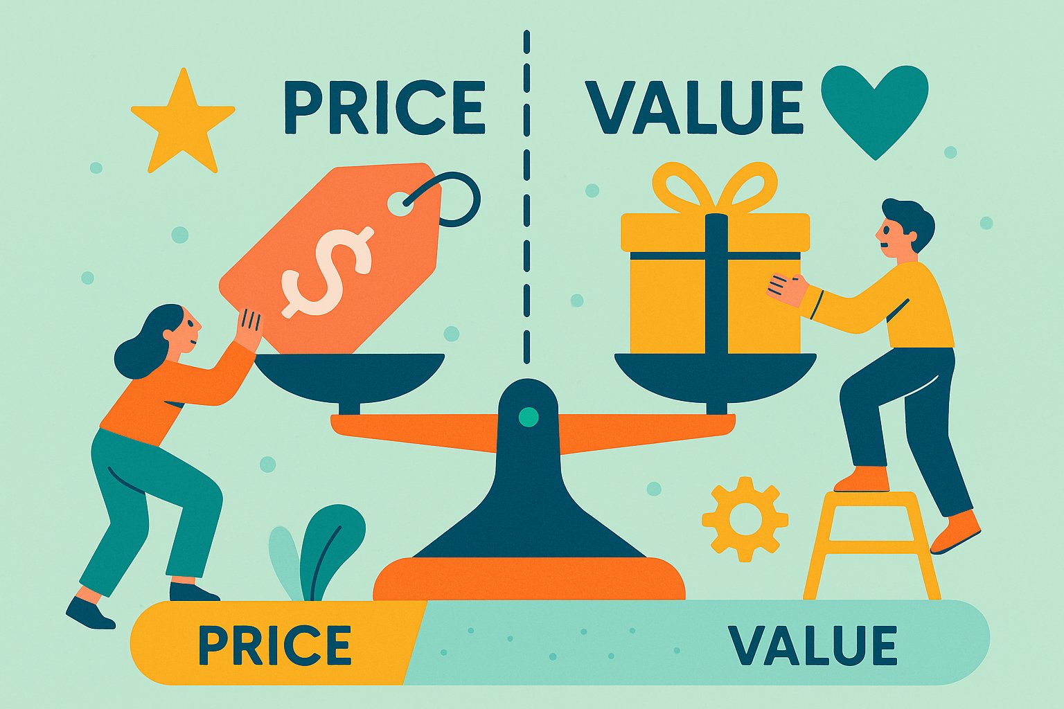
Once you’ve drawn visitors in with that magnetic hero section, it’s time to reinforce why they should commit before your official launch. Your value proposition is the promise you make—a bold statement of benefit that distinguishes your project from any others they might consider. Rather than listing features, focus on the transformation your solution delivers. For instance, instead of saying “Our smart lock has biometric sensors,” frame it as “Unlock your home in a fraction of a second—no keys required.” People connect with outcomes more than technical specifications.
To build that sense of urgency and exclusivity for pre-launch backers, mention limited quantities or time-sensitive perks. Perhaps early subscribers will gain access to a private webinar, an exclusive discount, or a chance to vote on a design element. Emphasize scarcity without sounding gimmicky: “Only 200 spots available at this price” taps into fear of missing out while maintaining professional tone. Highlight social proof when possible—if industry experts or beta testers have already praised your concept, share a brief testimonial. This positions your project as credible and desirable in the eyes of would-be supporters.
Structurally, place your value proposition close to the hero section or just below it, so visitors immediately understand the “why” behind the invitation. Employ concise, benefit-driven sentences that answer the central question burning in any newcomer’s mind: “What’s in it for me?” In doing so, you foster clarity and set clear expectations. By unveiling a compelling promise—coupled with a glimpse of the unique value only pre-launch backers receive—you create the psychological pull that compels visitors to sign up rather than click away.
Building Credibility Through Trust Signals
Trust is the invisible fuel that propels visitors from curiosity to commitment. Thoughtfully integrating trust signals on your landing page reassures pre-launch backers that your project is legitimate, reputable, and poised for success. One straightforward approach is to showcase any media mentions or partnerships. If a reputable blog has featured your concept or a well-known influencer has offered praise, a small “As seen on” section helps leverage their credibility. A stylized but subtle logo strip featuring recognizable names can anchor skepticism and encourage readers to explore further.
Equally important are customer-like testimonials, even if those customers are early beta users or friends who’ve had privileged access to prototypes. A brief, humanized quote—“I tested the first run of these headphones, and the sound quality blew me away”—carries weight. Pair each testimonial with a first name, location, or role (e.g., “Julian, New York City, Professional Musician”). This level of detail helps visitors feel they’re hearing from real people, not anonymous marketers.
If your project incorporates any certifications or industry accreditations, feature those icons or badges with concise explanations. Whether it’s compliance with safety standards, an environmental certification, or backing by a reputable incubator, these signals reinforce your project’s legitimacy. Finally, if you’ve hit internal milestones—prototypes built, patents filed, or initial funding secured—briefly highlight them in a dedicated section. The goal is to show that your project isn’t just a fleeting idea but a well-structured endeavor backed by real progress. By weaving trust signals naturally into the page layout, you reduce hesitation and create a sense of safety that nudges visitors closer to signing up as pre-launch backers.
Words That Resonate: Crafting Persuasive Copy
Your landing page copy is the voice that guides visitors from headline to conversion. Every word should be chosen deliberately—emphasizing benefits, addressing potential objections, and inspiring action. Start by understanding your target audience’s mindset. Are they early adopters eager for cutting-edge innovations? Are they passionate about sustainable practices? Once you pinpoint their core motivations, tailor your language to speak directly to those drivers. If eco-conscious consumers make up your audience, emphasize phrases like “reduce waste” or “minimize carbon footprint” rather than generic descriptors like “high-quality materials.”
An effective structure begins with a relatable problem statement. Paint a vivid scenario that mirrors the visitor’s reality: “Tired of juggling dozens of keys or fumbling with outdated security solutions?” This approach draws readers in, signaling “I understand your struggle.” Follow with your solution’s unique angle—illustrate how your product or service directly addresses that pain point. Keep sentences concise; web readers scan quickly, so a dense paragraph of uninterrupted text will likely be skipped. Instead, use short paragraphs—two to three sentences—focused on a single idea. Maintain a conversational, energetic tone to keep interest alive, as though you’re speaking directly to each reader.
When introducing key features or benefits, avoid jargon. If your product boasts “four gigabytes of on-board memory,” translate that into relatable terms: “Store thousands of photos and files right inside your device, ready whenever you need them.” This helps demystify technical attributes, making them more tangible. Whenever possible, tie features to emotional or practical outcomes: faster performance leading to saved time, or water-resistant design eliminating daily worries. Conclude each section with a gentle reminder of what action to take next—whether that’s “Sign up today” or “Join our exclusive insider list.” By weaving persuasive copy throughout, you maintain momentum and minimize friction, guiding visitors toward that all-important conversion.
Streamlining the Path: Optimizing User Flow
Even the most compelling copy can falter if the user experience feels clunky or confusing. A clear, intuitive flow ensures visitors know exactly where to click and what they need to do to become pre-launch backers. Start by removing extraneous elements that distract from your primary goal: signing up. If your landing page includes navigation menus that lead away from the page, consider hiding them or simplifying them to a single link. The fewer the exit points, the higher the likelihood that visitors remain focused on completing your call to action.
Next, place essential information above the fold whenever possible. Position the most critical details—your headline, value proposition, and CTA—in a visible area that doesn’t require scrolling. For mobile users, test how the page appears on various screen sizes. If the signup form or button is hidden too far down, you risk losing impatient visitors who expect swift conversions. Inline form fields should be concise—collect only what you truly need, typically just an email address. Additional fields can deter potential signups; ask for name or phone number only if it’s crucial for your pre-launch campaign.
Loading speed is another invisible barrier that can derail conversions. Optimize images for web by compressing them without sacrificing quality. Limit large background videos or auto-playing elements that might slow page loading. Tools like Google PageSpeed Insights can highlight performance bottlenecks and guide improvements. Finally, incorporate visual cues—such as arrows pointing toward the signup form or contrasting background boxes highlighting the CTA area—to guide the user’s gaze. Each small refinement to your page layout moves visitors more smoothly toward signing up, reducing friction and boosting conversion rates.
Iteration in Action: A/B Testing and Data Insights
A landing page is a living entity, not a static asset. Even after initial launch, ongoing refinement through A/B testing can drive incremental improvements in conversion rates. Begin by establishing a baseline: what percentage of visitors currently sign up as pre-launch backers? Use your email marketing platform’s analytics or integrate with Google Analytics to track form submissions and click events. Once you have that baseline, choose one element to test—perhaps the headline, the color of the signup button, or the placement of testimonials. By changing a single variable at a time, you isolate its impact and learn which version resonates more effectively.
For example, you might test “Exclusive Early-Bird Access” against “Join Our Pre-Launch Insider List” as headlines. Monitor open rate equivalents—how many visitors click through from your ad or social post—and track subsequent form submissions. If the latter headline consistently yields a higher conversion rate, consider rolling it out permanently and exploring other elements to tweak. Similarly, test the color or shape of your CTA button. A button that pops against your background might encourage more clicks, but subtlety is key—avoid clashing colors that feel unprofessional. Even minor gains, such as a 2% lift in conversions, can translate to dozens or hundreds of additional pre-launch backers.
Beyond A/B testing, gather qualitative feedback from early visitors. Include a brief, optional comment box asking why someone chose to sign up or what concerns might prevent them from committing. These open-ended responses can reveal friction points you might not detect through quantitative metrics alone. Regularly review heatmaps and session replays—tools like Hotjar or Crazy Egg—to see exactly where users hesitate or abandon the page. By combining quantitative data with qualitative insights, you chart a clear path for continuous optimization. Iteration keeps your landing page fresh, responsive to user behaviors, and primed to convert more visitors into enthusiastic pre-launch backers.
Powering Up: Traffic Sources and Analytics Tracking
Building a perfectly optimized landing page is only half the battle; you need a steady stream of qualified visitors to fuel conversions. Identifying the right traffic sources starts with understanding where your ideal audience spends time online. If your project is tech-centric, developer forums, LinkedIn groups, and specialized tech blogs may be ideal. Creative products might thrive on Instagram, Pinterest, or design-focused newsletters. Content marketing also plays a critical role: writing blog posts that address your audience’s pain points and weaving in links to your landing page can generate organic interest over time.
Paid channels can accelerate your reach, but require careful targeting. Platforms like Facebook Ads and Google Ads allow you to define audience segments based on interests, behaviors, and demographics. Craft ad creatives that mirror your landing page’s tone and messaging, ensuring a seamless experience when visitors click through. Importantly, configure UTM parameters on your campaign URLs so you can distinguish which ads, posts, or referral links are driving the most conversions. This data clarity allows you to reallocate budget from underperforming channels to those delivering the highest return on investment.
Social media platforms also offer retargeting capabilities. By installing a simple tracking pixel on your landing page, you can build custom audiences of visitors who didn’t convert on their first visit. Serve tailored ads to those individuals, reminding them of the benefits and nudging them to revisit the page. Email marketing itself can become a traffic driver—encourage your existing email list to share your landing page with friends who might be interested. Every time someone engages and shares, your reach grows exponentially.
Finally, set up comprehensive analytics tracking before you launch. Integrate your email platform with Google Analytics or a similar tool to monitor key metrics: number of visits, bounce rates, time on page, and most crucially, conversion rates. Use dashboards to visualize performance trends over days and weeks, and schedule periodic reviews to ensure you’re on track. By combining optimized landing page design with strategic traffic acquisition and rigorous analytics, you create a self-reinforcing system that continually attracts and converts pre-launch backers, setting your crowdfunding campaign up for a triumphant launch.